Writing Errors That Small Businesses Make on the Website Homepage
If you avoid these common errors, then your website will be closer to running like a machine.

Free eBook: The Customer Journey

Learn the sales framework that the big businesses know
to increase purchases and maintain customer relationships.

A small business’s website is very important, even in the age of social media. It’s the reason why every corporation has its own company website. These big companies spend a lot of money from their advertising budget on maintaining a website. And for good reason. The homepage of a website is one, if not the most important part of a website. It is the page that appears first when someone arrives at your .com website. Therefore, it is not just important to feature the right information on the page, but to also optimize it by not putting the wrong things on it.
I’ve looked at a lot of small business websites, and I have noticed that a large number of them often make the same errors on their website home page.
For starters, here are some things that a small business (and even some big businesses) should never put on the homepage.
Limiting the Bounce Rate
The reason why the homepage is so important, is because of something called a “bounce rate”. If you are not familiar with that term, then I suggest to write it down to memorize it. The bounce rate is the rate of people who click out of the homepage of a website. This can be for a number of reasons, including that they weren’t interested in the website in the first place. However, a bounce rate can also include people who are considering your business, but get bored and click off, and there can also be numerous reasons for why.
You want to make sure that you optimize your website so that you can reduce the amount of bounces that happen because of errors or inconsistencies that could have been prevented by orienting and positioning your website’s information in a way that communicates better.
1. Company History and Storytelling on the Homepage
Storytelling is important for big brands that have a long history of quality.
While storytelling does belong on a small business website, the story of your company’s founding should not be on your homepage. And this information definitely doesn’t belong on the homepage.
A lot of small businesses want to place self-flattering information about the company on the front page. Every business wants people to believe in good things about the company. However, this is not what any business should be putting on a company website’s homepage.
Such information is irrelevant. We are talking about any type of copy that uses company history and founding stories that discuss the longevity of the company. This information should always be placed on the company’s “about” page, and is also encouraged. People who are interested in the story can always read about it there.
It is important to lead the user right to information about the product. This isn’t just because it makes it more likely that the user will buy a product from the company, but it’s also considerate. The user is at the website because it needs the company to solve a problem. Placing information about the company’s founding first is not relevant to solving the user’s problem.
2. Not Using Headings for Homepage Content
When people usually think of headings, they think about articles and blog posts. Other pages on the website need headings too, and that also includes the homepage, which is the first page of your small business website.
For instance, if you have a homepage, you likely have a lot of information on it that leads people to different pages.
There is an industry jargon for the sections of a web page. Therefore, we’re going to cover some of the basics of UI design in this post.
The Fold
You may feel the urge to put as much information on the homepage as possible. But, that’s not necessary. It is recommended to have a navigation menu, because this allows the user to easily navigate between the
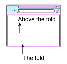
The most important information should be above the fold. Anything that is visible when a webpage first loads is called “above the fold”. The bottom of the screen that can’t be seen is the fold. This is usually content that is hidden at first, but revealed as the users scrolls further to view the content. Because this is what the user sees first, then it’s important to create a pathway that leads the user into the content. It is preferred that the user should not have to scroll on the homepage to the most important information that you want them to read first. The information should have enough brevity that the user can understand what the company is about in a few words.
Content that is below the fold could be whatever the next most relevant information is.
3. Not Highlighting Small Bits of Important Information
This one is also a design error, but it needs to be said.
Make sure your social icons are visible and can be seen. I have seen some people place social icons that use darker colors on dark colors, or lighter colors on light colors. Also, it is important to have words near the social icons. Simply writing the word “social” above the icons is all that you need to do in order to lead people to the icons.
Use Graphics for Small Bits of Important Copy
I commonly take notes on common errors for copy, and another thing I notice is that people don’t take advantage of using graphics for small, non-rhetorical pieces of copy.
For instance, I looked at a particular small-business website for a Kombucha tea beverage. On their company website, they wrote a small bit of copy to inform the users that their beverage is available at a local Farmer’s Market. This is very important information because it tells the users where they can buy the product. The information was placed in the header graphic using a very small font.
It’s also imperative to put information on the homepage of your website that instantly differentiates your product from other products, if applicable. For more about differentiation strategies, read this article about differentiating your company. It is wise to use a headline that conveys what makes your business stand out.
Don’t be afraid to have a message like that placed on something, such as a brightly-colored button. By doing this, the information “jumps” toward the user so that they know where to find it. Why? Because people get bored, and if they don’t find the information fast enough they will lose interest in it. When people lose interest in a company website, this affects the bounce rate.
4. The Homepage Looks Stagnant
Perhaps one of the more overlooked but important reasons why people click off of your website may be because it looks like your company may not be in business. This is not just for people who have been to your website before. Small business websites
Sometimes people will believe that a company is no longer in business even if they have never heard of the company. The reason is because your website may have information on it that is outdated or points to a specific period in time.
Do you still have information on the homepage of your website that informs the customer about your hours during the pandemic? That can be an indicator that the company may not be in business, but it can also be an indication that the company doesn’t maintain the information on their website, which makes the company look like they don’t care. That’s not something that you want to convey, so make sure that you do not have outdated relics sticking around on your website’s homepage.
Be seasonally up-to-date.
Another thing is to simply have something on your website, such as a graphic, or some words that quickly discloses the year. Are you having a “spring sale”, then place it on the front of the website. Some companies use different “skins” for their website’s page that conveys what time of year it is. While this is a good idea,be mindful to change those skins with the actual season. Because if it is the Spring, then you don’t want any graphics on your website’s homepage that has winter graphics, or Christmas-related things. Websites are generally easy to edit, so to the customer this may look “lazy” if you still have a 4th of July sale on the front homepage when it is December. And don’t think that this isn’t a common mistake, because a lot of small businesses overlook these simple things.
A website that looks like it is stuck in the 1990s.
While minimalist websites are to-the-point, and there are many people who like websites that are in the “web 1.0” style, it probably isn’t good for your business because that is a small niche of people. For instance, a lot of the big names in the tech industry have blogs and personal websites that are in this style, because a lot of tech entrepreneurs and software engineers like the simplicity.
There are a lot of small businesses who began their company websites in the 1990s and have not done a thing to change the aesthetic. This can make the website look outdated and make the owners of the business look like they are behind the status quo. So, while you don’t have to have a super-flashy website, it wouldn’t hurt to switch to a new layout.
Keeping your website up-to-date is about communication more than everything. Because, like we always say here at The Copywriter Source, copywriting all about communication.
